![]()
Photo Source

The term “full-gut kitchen remodel” tends to make people think of an expansive, high-end kitchen with all the bells and whistles – where surrounding walls have been knocked out to create an open floor plan, the luxury countertops are never-ending, and the shiny, new appliances are massive in size, all contributing to a show-stopping completed project. While there’s absolutely nothing wrong with the idea of an over-the-top large kitchen remodel, only a small fraction of our clients actually have this experience. Every project is different when it comes to the size of the kitchen, it’s starting condition, the client’s aspirations for the space, and of course, the budget. More often than not, the kitchen remodels we complete are done in small or medium-sized kitchens where the clients are trying to update the aesthetic, but also make the most of the existing space. Sometimes, due to the structure of the home and other limitations, it’s simply not realistic to remove walls or install large appliances. However, just because you have a small kitchen doesn’t mean it can’t be remodeled into the beautiful kitchen of your dreams! There are many kitchen design ideas and techniques that can help a small kitchen feel bigger and look just as impressive as a larger one.
Here are 4 ways to make the most of a small kitchen remodel:
![]()
Photo Source

1. Create the Illusion of a Larger Room
Lighting can make an amazing impact on the size perception of a room. Over and under-cabinet lighting really catch the eye and make the space feel bigger. Installing LED can lights in the ceiling can work with the under-cabinet lights to produce a “shadow-less environment over workstations. Because the can lights are flush with the ceiling, they make ceilings feel higher, as they replace hanging light fixtures and bulky rectangular box lights that take up vertical space.
Skylights are another great way to brighten the kitchen and make it feel larger and more open. If a full-size skylight is not an option, sun tunnels are a comparable alternative that will let in a surprising amount of natural light. If you have windows around the kitchen, it’s a good idea to keep the drapery or window treatments to a minimum to avoid a cluttered look.
On the topic of making the room bright, keep in mind that lighter paint colors are always better for small spaces. While dark colors will make the room feel small and oppressive, light colors will produce an open, airy feel. This means using lighter paint on the walls, cabinets, and trim, with some darker colors in smaller portions, such as accent pieces.
Removing low-hanging soffits or fur downs is something we always recommend to our clients. If it is possible and it makes sense for the project, it is well worth the extra cost. Updating up the ceiling by removing popcorn texturing and applying a fresh coat of paint is also recommended to just about off of our clients, simply because it makes such a big difference once it’s done!
Another trick that makes the walls look taller is to extend the cabinets all the way to the ceiling. Whether you are completely replacing your cabinets or keeping the existing ones, modifying them to extend as high as possible will win you some additional storage space along with the effect of a bigger kitchen. Often times, we install glass-front cabinet doors on these upper cabinets to create a softer feel. Having LED backlights installed in these cabinets will draw attention upward and create a stunning showcase for glassware collections and other knick-knacks.
![]()
Photo Source

In many cases, having a tile accent wall that reaches to the ceiling (usually where there are no upper cabinets) is a good option as well. Having the backsplash only extend partially up the wall where there are no upper cabinets creates a break in the design and can make the walls feel shorter. This is another design option that will cost a little extra but will reap great aesthetic appeal.
Similar to the effect of using tile all the way up an accent wall, choosing larger floor tiles or a continuous flooring — such as vinyl planks — can give the room a sense of consistency and flow to prevent a choppy or busy look.
2. Choose Smaller Appliances
There are many types of space-saving appliances on the market today that fit the dimensions of smaller kitchens and are still fully functional. For example, you can now find refrigerators that are just 24 inches deep instead of the standard 30 inches, as well as stoves and cooktops that are more compact and narrow yet possess the same features as larger models. You might think a few inches here and there doesn’t make that big of a difference, but the smaller your kitchen is, the more and more valuable every inch becomes!
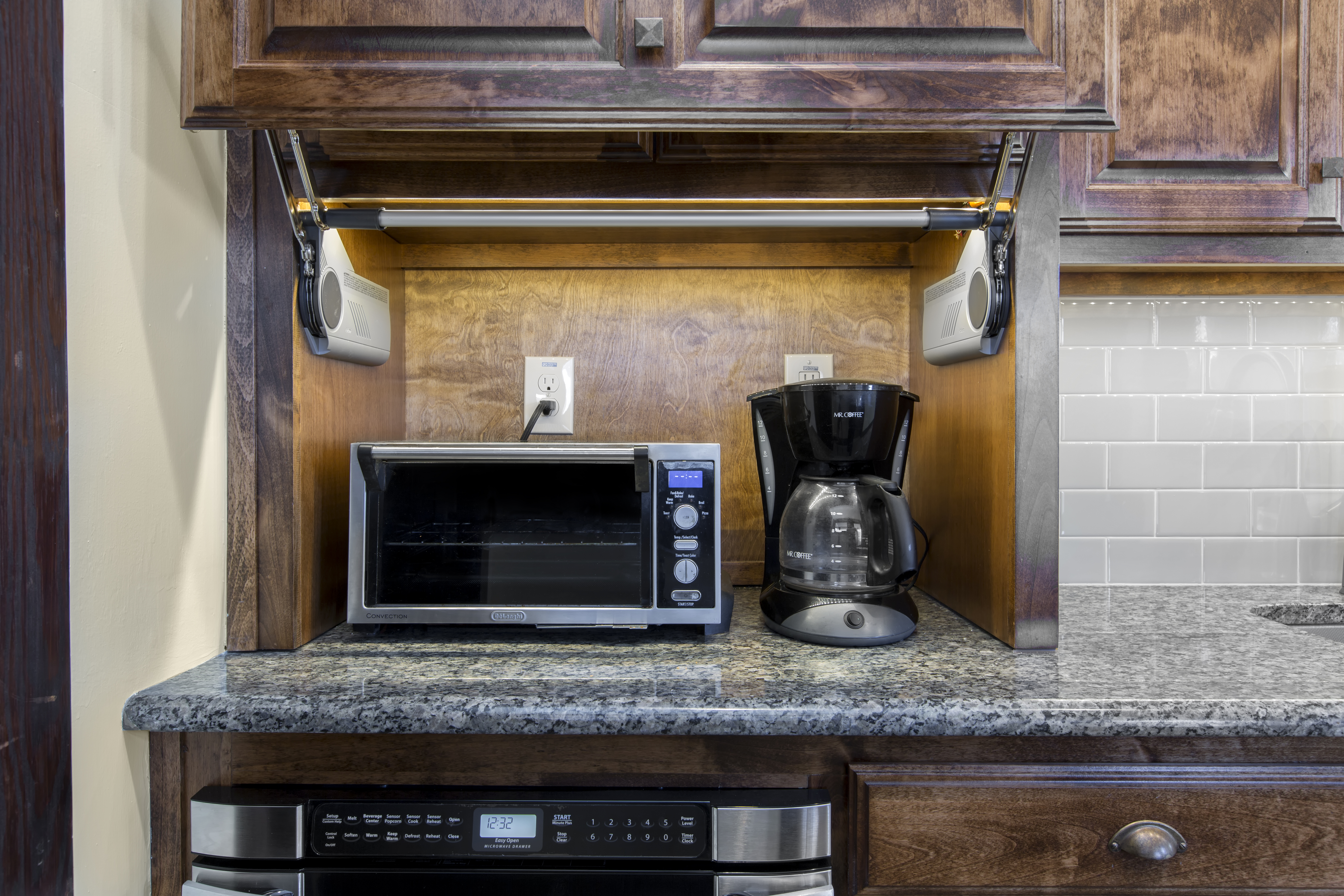
If possible, countertop appliances should be kept to a minimum. For things like toaster ovens, coffee makers and blenders, we often suggest incorporating an appliance garage or drawer into the cabinet design to provide a hidden storage space for these items when they are not in use. For microwaves, we usually suggest installing an under-counter microwave drawer instead of the traditional option. It’s amazing what an impact a clean, clutter-free countertop can make in the appearance of your kitchen.
The layout of the appliances is important, too. In compact kitchens, you want to make sure there is enough space to open the refrigerator doors or the oven door while still allowing enough space for the cooks and guests to move around the kitchen. The best rule is to incorporate the kitchen work triangle into your floor plan. See our blog for more information about the kitchen work triangle.
3. Keep Optimal Storage in Mind
Part of what we do at Medford Design-Build is to create a design that is most efficient for each individual kitchen. That includes working with our cabinet company to create a cabinet layout that offers the best space optimization and storage solutions. We strive to incorporate features such as pull-out pantries, deep pot drawers, stacked utensil drawers, cookie sheet racks, Lazy Susans, pull-out trash bins, and appliance garages. Taking advantage of vertical space is key to making the most efficient use of a small space.
![]()
Photo Source

In fact, when it comes to lower cabinetry, we almost always suggest installing large drawers instead of actual cabinets. This goes for small kitchens and large kitchens alike. Drawers provide the best utilization of space with much easier access than a deep cabinet. It’s much more convenient to slide out a drawer than to get down on your hands and knees to pull out every pot in the cabinet just to get to one in the very back. Here is our blog about choosing drawers instead of lower cabinets for your kitchen remodel.
![]()
Photo Source

4. Remember, Less is More for Design Selections
A kitchen that is being remodeled is like a blank canvas to an artist: there are various design selections to be made that will come together in the end to create a beautiful, integrated space. These selections include things like cabinet style and finish, countertop material, cabinet hardware, plumbing and light fixtures, backsplash tile, and flooring. It’s easy to go crazy and choose the most intricate, decorative options with a stunning outcome in mind, however, it’s important to remember that less is more when it comes to small spaces. As beautiful and unique as ornate cabinetry and decorative hardware can be, it can definitely overwhelm a small kitchen. Just as you wouldn’t want to fill a small living room or bedroom with bulky furniture and oversized artwork on all of the walls, having too much detail in the kitchen can make it feel crowded and messy. Keeping it simple might be a challenge if you have very traditional taste, which often includes a lot of heavy trim and carved details. Dimensional finishes, flashy backsplash tile, and busy countertops are not necessarily “bad” choices or completely off limits, but they may not work as well in a small kitchen as they would in an expansive one. Clean lines, simple cabinets, and minimalistic hardware elements will work together to create an open, roomy feeling in a smaller kitchen.
As a part of our design process, we offer professional design assistance from our experienced Interior Designer. She can help you choose the perfect design selection items for your kitchen while keeping your individual taste and style in mind. We also manage all of these items by ordering and tracking everything for you, ensuring that everything is delivered on time and in the right quantities for your remodel. What might seem like the most overwhelming and intimidating portion of your remodel isn’t so scary when you’ve got our team of professionals to help you through each step!
![]()
Photo Source

Although small kitchens present unique challenges, they can still be remodeled in a way that creates a beautiful, functional outcome. By making the most of the available space, choosing the right appliances, and incorporating smart design choices, your remodeled kitchen can feel larger and have that “wow” factor that you’re hoping for. Even if you can’t complete a full remodel, implementing even a few of these ideas into your existing kitchen will make a big difference.
If you are interested in remodeling your kitchen and would like more information about our process and services, contact us today! Our team would be happy to help!
Warm Regards,
The Medford Design-Build Team
The post 4 Ways to Make the Most of a Small Kitchen Remodel appeared first on Medford Remodeling.


